We’ve updated our look!
We’re excited to announce a complete rebrand of Centre for Suicide
Prevention! This includes a new website, logo, and newly designed materials.
 Why the rebrand?
This year, we’re 35! We’ve been in the suicide prevention field for many years
and we thought it was time for us to take a good, hard look at our mandate: to
equip Canadians to respond to those at risk of suicide. Our rebrand reflects
the fact that we are reaching out to new audiences – including those most
affected by suicide: middle-aged men. With this, we decided to present
ourselves in the same way we always have: friendly, supportive, and
knowledgeable, with the extra bonus of being professional too.
Most of all, this rebrand happened with the goal of becoming more accessible to everyone,
because suicide prevention is everyone’s business! Each individual member of
the community has a role to play in preventing suicide. We hope our new website
is more accessible, easier to navigate, and that our new brand appeals to a
wide range of people: we want to equip all Canadians to respond to those
at risk of suicide.
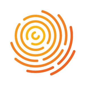
What we see when we look at the new logo
Our new logo can be read a number of ways, but here’s what we liked about it.
The thumbprint shape honours individuality – suicide is complex because individuals are
complex. If we get to know those around us on a personal level, if we take the
time to really show them that we are listening, we can honour their
individuality, and connect to them on a deeper level. If that person is
struggling, we may even make them feel comfortable enough to share this with
us. It is then that we can connect them to help and perhaps even save their
life.
The shape also reminds us of community – we see a sense of activity and connectedness.
Community is vital to suicide prevention, as a holistic approach involving all
community members, organizations, and levels of government is required to
effectively reduce the rates of suicide.
Finally, we liked that the colours and shape represent the vibrancy of life, which is the
ultimate goal of suicide prevention. In addition to representing life, they
also pay homage to our previous logo, the sun.